
5 Ways Web Design Can Improve Email Collection Rates
To this day, email marketing remains one of the most effective digital marketing tactics available to practically every business, large or small. What determines its success, though, is not just the quality of the subject line or the personalization of the email body. It’s the way you collect your email addresses in the first place. After all, if you only have 100 contacts on your list, you will hardly be able to grow year on year.
In this post, we’ll be looking at five tips that will help you design web pages that can improve your email collection rates and thus level up your overall marketing game.
Use a Vibrant Color Story
For starters, let’s take a look at how the overarching design of a page impacts email collection rates.
Leads don’t like boring landing pages. In fact, they may quickly decide to jump ship and look for a more promising prospect elsewhere if your page fails to engage them. Keep that in mind: visitors don’t just want to feel welcome; they need to be engaged.
One of the ways you can use web design to attract more email signups is to incorporate vibrant colors on your pages. They don’t have to be garish or particularly bold. They should, however, make the page feel alive and interesting.
Let’s take a look at an example. Mixam has a very vibrant and lively landing page, yet the colors they’ve used are not actually “out there.” They are merely fresh and light.
The same shade of blue-green runs throughout the page, including the email signup form. This provides the necessary cohesion and ease of navigation as well.
Use a Pop-Up
Our next piece of advice will be a bit controversial, as pop-ups have their clear pros and cons. On the one hand, they clearly invite a lead to sign up to your email list. They may have otherwise omitted to do that simply because they hadn’t noticed the form. On the other hand, pop-ups can admittedly be rather annoying.
Your best course of action is to test it out. Monitor how many people leave the page after the pop-up has shown up. Then, compare this number to the emails you do manage to collect. If it’s worth it, keep the pop-up; otherwise, consider a different approach to gathering emails.
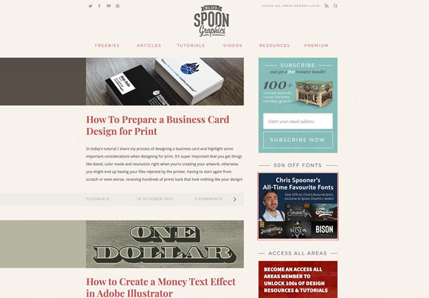
A good example of a pop-up comes from Spoon Graphics. They’ve featured a pop-up that’s visually appealing enough, but they also feature the same signup form at the top of the page. That way, they’ve covered all their bases and are most likely to convert visitors to leads.
Make the CTA Pop
Speaking of things that pop, you should also consider making your email signup calls to action attention-grabbing. The key to web design that converts is ensuring that the eye naturally travels to where you want it to land. In this case, that would be the email signup form and its accompanying CTA.
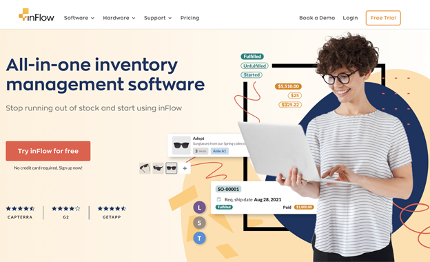
There are numerous tricks to achieve this effect. You can use different fonts, bolder lettering, more striking colors, a specific box, and so on. InFlow has, for example, made their free trial (which is also their email collection) forms noticeable by turning them into a red button.
You can’t miss it, yet it’s still seamless enough not to take up all the attention on the landing page.
Put the CTA in the Main Menu
You can also choose to put your CTA very front-and-center and add it to your main menu. That way, they will always be noticeable and easy to reach, and visitors won’t have to scroll up and down a page to convert.
This practice is in line with the philosophy of ensuring visitors don’t have to guess too much and that they’re able to perform a desired action with as little fuss as possible. In this case, if they happen to decide they like your content and want to receive more in their inbox, they can sign up instantly.
Bay Alarm Medical has adopted this tactic. They have a very useful menu where you can find your way around their simple website layout and start your trial (and leave your contact details).
Add Some Social Proof

Finally, if you want to convert someone into giving you their contact details, perhaps you want to give them ample reason to do so.
Adding plenty of social proof right next to the email signup forms (or to the landing pages whose sole purpose is to gather emails) can be just the hook you need. After all, hearing from fellow clients will always be more impactful than reading a brand’s own marketing copy. So, if you have testimonials and reviews to add, make sure you don’t omit them.
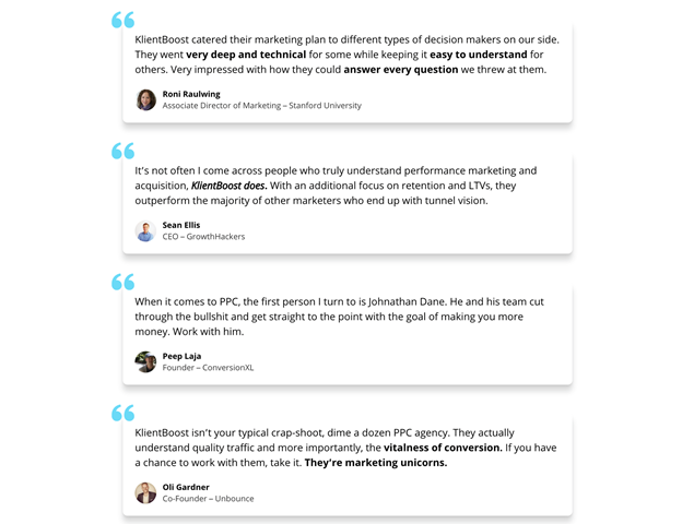
KlientBoost does this well, plus they have an email collection page (also known as a piece of valuable gated content). Here they’ve used plenty of social proof and designed the flow of their page rather seamlessly. You can convert at the top and the bottom, with a nice bit of social proof sandwiched between.
Final Thoughts
All of these web design tactics can help you collect more emails and improve your email marketing campaigns. Make sure you carefully consider which would make the most impact on your target audience. On top of that, you’ll also want to consider how easy and effective it will ultimately be to alter the current layout of your pages.
No Comments